
Myna AI
| 2025
Designing Interfaces for AI That Executes Work
TL;DR
Myna operated inside a multimodal chat interface. Users could generate responses, create social posts, and analyze content, but as tasks grew complex, chat alone couldn't manage them. I designed a task card system that bridged conversation and execution, then scaled it into a reusable foundation for future AI workflows.
The pivot needed more than a new task structure. It needed a new interaction model. I designed the task card system - a human-in-the-loop pattern that turned AI chat responses into structured, reviewable units of work. Then broke it into 6 reusable UI primitives so every future AI workflow could be assembled from the same foundation.
The task card was the missing layer between what the AI could generate and what the user could actually act on. It was directly responsible for enabling the +65% task completion outcome. Without it, the weekly task system from Tab 1 would not have been executable.
Role
Product Designer
Impact
Structured AI Workflows
Introduced task cards that turned chat responses into clear, reviewable units of work.
Faster Decision-Making
Users could quickly scan outputs, edit, and approve actions without digging through long chat messages, guide or correct the system when needed and track work as it progressed
Reusable Interaction Model
The task card became a scalable pattern used across multiple workflows like review responses and social media posting.
Foundation for Future Workflows
Modular UI primitives enabled the system to support new AI tasks without redesigning the interface.
The Problem
Chat works for expressing intent. It breaks when you need to manage the lifecycle of AI work. Those are two different interaction problems - and the interface was only solving one.
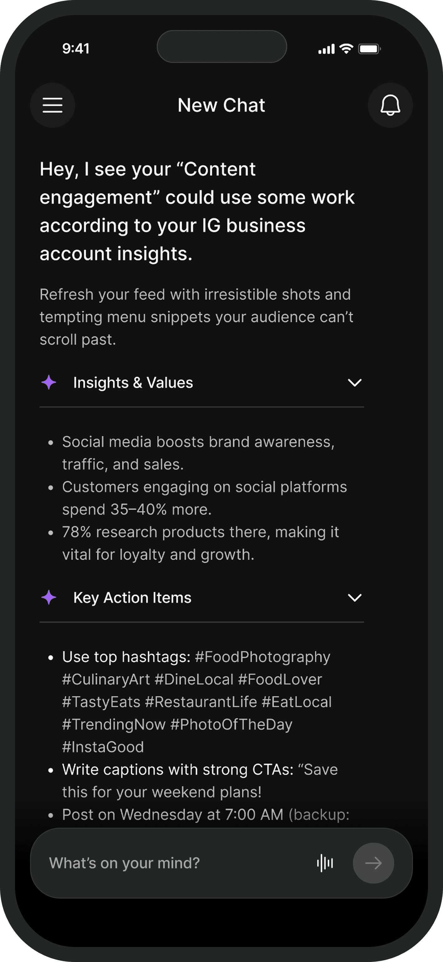
Myna operated inside a multimodal chat interface. For simple requests it worked fine. But as the product moved toward structured weekly task ownership, chat alone could not manage the work.
The failures were consistent. Users could not track task status without scrolling back through the thread. AI outputs were buried in conversation with no stable place to review them. There was no clear moment to approve, edit, or reject what the AI had generated. When users wanted to correct the system, there was no structured way to do it without starting the conversation over.
The Guiding Decision
The obvious solution was a separate task dashboard. I decided against it. Structure needed to come into the conversation - not move the user out of it.
A separate task layer would have broken the flow that made Myna feel natural. Restaurant owners were already comfortable starting work in chat. Sending them to a different surface to complete it would have reintroduced exactly the context-switching the pivot was designed to eliminate. The trust built with the chat entry point would not transfer automatically to a new interface.
The right call: bring structure into the conversation. Task cards appeared directly inside the thread - each one a self-contained unit of AI work that could be reviewed and acted on exactly where it appeared.
Designing the Task Card
One card. Three layers. One loop. Context gives the anchor, status makes the lifecycle visible, decision makes the next action obvious.
The task card needed to do three things at once: give users enough context to evaluate the output, show where the task stood in its lifecycle, and make the next action obvious without requiring explanation. I structured every card around three layers:
Context
The original prompt, file, or request that triggered the task. Without this, users were evaluating an AI output with no reference point to check it against their original intent.
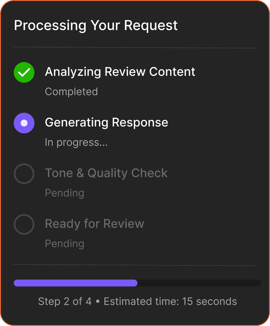
Status / Output
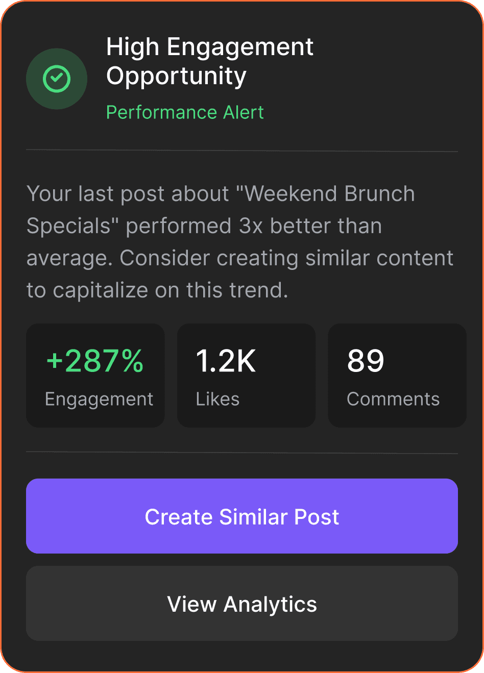
The task lifecycle made visible. Cards moved through states: generating, ready for review, completed. AI outputs appeared as structured results inside the card - scannable and editable, not buried in chat.
Decision layer
Approve, edit, regenerate. Three actions that covered every decision a user needed to make at any point in the task lifecycle - always visible, never buried.

Human-in-the-Loop by design
Every card surfaced a review checkpoint before any AI output could be acted on. The system generated. The user judged. That was the interaction contract - and it was deliberate.
Restaurant owners did not trust AI-generated outputs enough to act on them without review. The task card was the design response to that finding. Users were never passive recipients of what the AI produced - they were positioned as the decision-maker at every step.
This was also the decision that addressed the 50% reduction in AI-related complaints. Vague or incorrect outputs in a free-form chat interface had no clear interception point. The task card gave users a structured moment to catch, correct, or reject AI behaviour before it caused a problem - turning a source of frustration into a natural part of the workflow.
Scaling the Pattern
The task card was not tied to any specific workflow. It was a container for AI work. Breaking it into 6 primitives meant every future workflow could be assembled without redesigning the interface.
Once the card worked for one workflow, something became clear: it was not workflow-specific. The task type changed. The interaction model underneath it did not.
That insight drove the decision to break the card into reusable UI primitives:
Any new AI workflow could be assembled from these six without redesigning the interface. Review responses, social media scheduling, content analysis - each one was a different combination of the same building blocks.


Progress indicators
Feedback modules

Action triggers
Outcomes
The task card made the +65% result possible. Owners could complete a review response in under 3 taps without leaving the conversation.
Outcome
Signal
What it means
Task Completion rate
+65%
The weekly task system could not have been executed without a stable place to review and act on AI outputs. The task card was that layer.
AI-related complaints
-50%
Structured review checkpoints meant users could catch, correct, and redirect AI outputs before they caused problems
Workflows supported
Multiple, no redesign
Reviews, social posts, and content analysis all ran through the same card pattern - assembled from existing primitives
UI primitives delivered
6 reusable components
Task containers, input blocks, review sections, progress indicators, feedback modules, action triggers
Trade-offs Made
Chose structure and scalability over flexibility and speed.
Traded away
Freeform chat flexibility
Per-workflow UI design
Full automation
In favor of
Structured, reviewable outputs
Reusable primitives across all workflows
Human review at every decision point
Key Takeaways
Chat is an entry point, not an execution environment. Human-in-the-loop is a design decision, not a default. Patterns scale. Screens do not.
1
Chat is an entry point, not an execution environment.
Chat is the most natural way for users to express intent. It became the entry point for every task, not just simple ones
2
Human-in-the-loop is a design decision, not a default.
The task card positioned the user as the decision-maker at every step. That positioning was what made the AI feel trustworthy rather than unpredictable.
3
Patterns scale. Screens do not.
Designing for reuse from the beginning was the only approach that would not accumulate debt at this scale.
4
Interaction infrastructure is invisible when it works.
The task card was not the feature users noticed. It was the reason the features they did notice felt natural and reliable.
Next Steps
1
Progressive Onboarding
Introduce the interaction model gradually. Users start with simple chat tasks, then unlock editing outputs, correcting results, and triggering follow-up steps.
2
Long-Running Campaigns
Extend the system to support ongoing work: tracking multiple task cards, monitoring progress, and managing outputs over time.