National water informatics center
Designed dashboard mockups as a Proof of Concept (POC) for an Integrated reservoir management system that makes navigation and decision-making easier for policymakers across India.

My Role: UI/UX Designer
As a junior designer, I eagerly took on the project. I knew that the key to success would lie in designing intuitive, clear, and visually engaging dashboards that could present data in ways that allowed policymakers to act quickly and confidently. My focus was on effective data representation—using graphs, and charts to simplify vast amounts of information.
Project Type: Proof of Concept
Duration: 2 Weeks
Team Size: 1 Designers & 1 Design Principal
Domain: Water Resources Management and Hydrology.
Tools: Figma, Google Suite
Existing Design (2021)
The image shows - Areas that needed a redesign for the POC. The entire website cannot be entirely produced due to government site restrictions.
It was clear that the task was critical for policymakers across India. The system had to streamline navigation and decision-making for a complex network of water resources, enabling better management and utilization.
I began by analyzing the needs of the policymakers that were identified by business and pre-sales teams, understanding that the dashboard had to be more than just functional; it needed to be user-friendly, aesthetically balanced, and accessible even for those without technical expertise.
I created mockups that showcased key metrics, from water levels and usage patterns to predictions of future needs based on historical data. By focusing on visual clarity and simplicity, I ensured that each element on the dashboard contributed to making navigation seamless and data interpretation straightforward. These designs allowed for quick comparisons, highlighting critical areas of concern, and enabled policymakers to make informed decisions faster.
State level IRM dashboard
Display of the current capacity of Nagarjuna Sagar dam
Reservoir level information
Water level
Water release
Rainfall
Inflow
Outflow
Surplus
Deficit
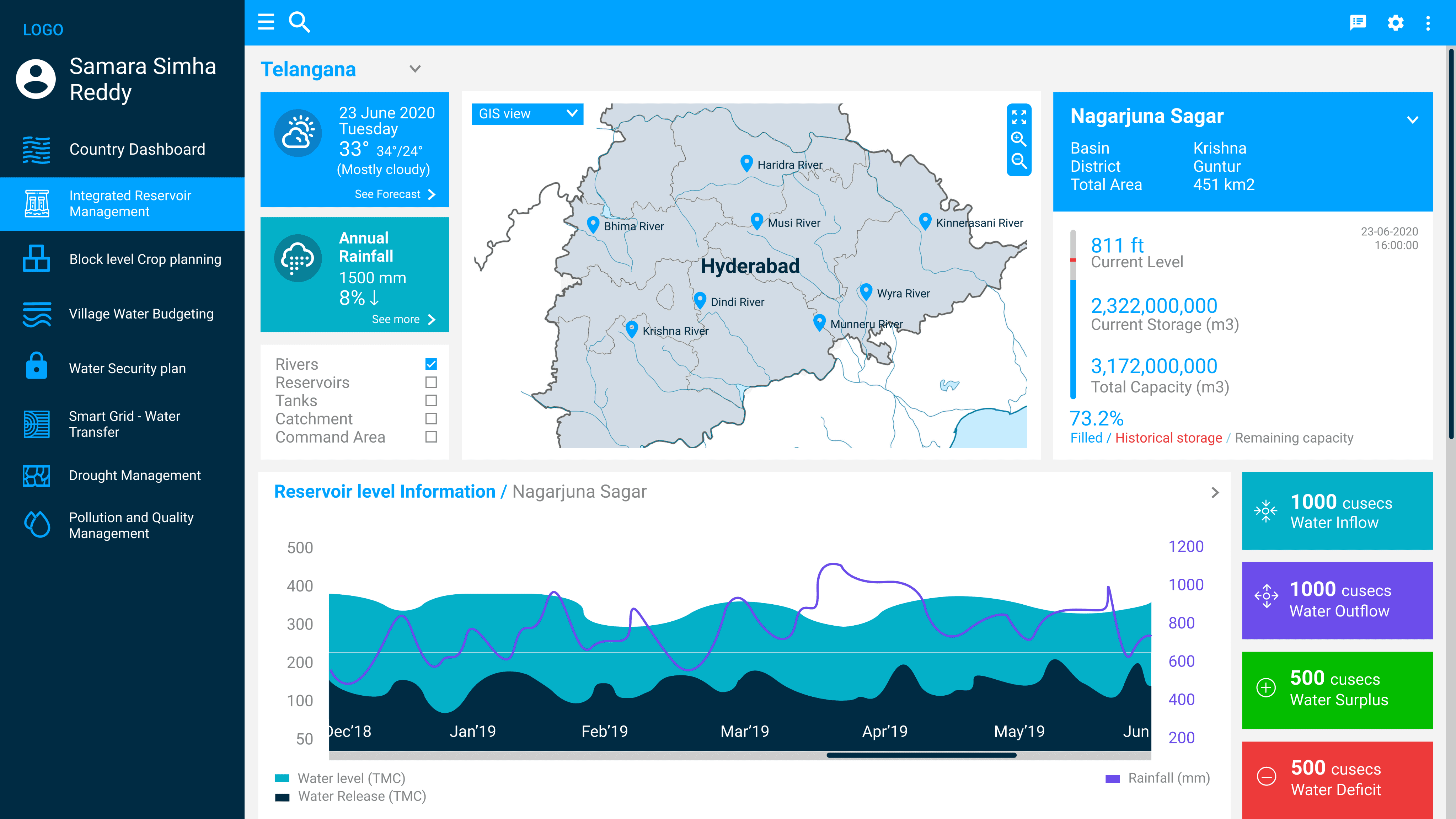

Flood chart
Determines Flooding across area in sq Km.
Water demand
Determines water availability, demand and planned.
Hydrograph
Determines rural discharge and urban discharge against rainfall.
River basin view
Determines the water level data of different rivers.
Reservoir type view
Determines the type of reservoir based on major or minor.
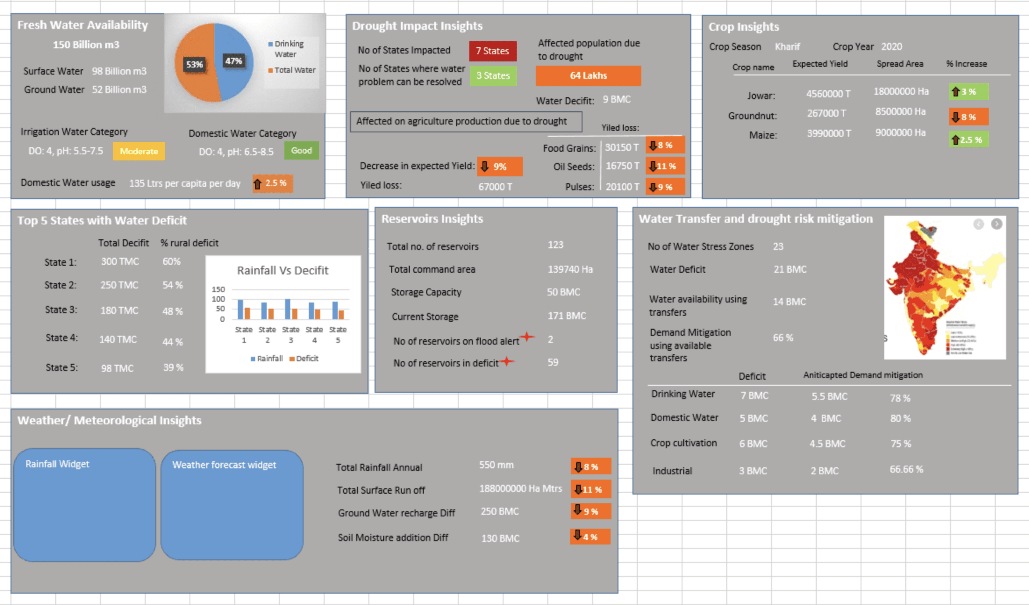
Country level IRM dashboard
Display of water availability in the whole of India
Reservoir insights
Total no of reservoirs
Number of reservoirs on flood alert
Number of reservoirs in deficit
Drought impact insights
States impacted
States where water problem can be solved
Water transfer and drought risk mitigation
Number of water stress zones


States with water deficit
Rainfall vs deficit
Fresh water availability
Crop insights
Domestic usage
Conclusion
Despite the effort put into creating a comprehensive Proof of Concept (POC for the Integrated Reservoir Management System, the project was not selected for further development. However, the experience was invaluable. As a junior designer, I poured my focus into crafting dashboard mockups that aimed to simplify decision-making for policymakers across India. I prioritized data representation through clear infographics, graphs, and visual aids, ensuring that the complex information was both accessible and actionable.While the POC may not have been chosen, it was an important learning experience. It challenged me to think critically about user needs and hone my skills in presenting complex data in a way that could influence real-world decisions. The project reinforced my understanding of designing for impact and the importance of resilience in the design process.