
Myna AI
| 2025
Designing a Brand Identity for an Intelligent Platform
Myna helps people interact with intelligent systems in a way that feels natural, intuitive, and approachable.
The goal of this project was not just to design a logo or choose colors, but to create a brand identity that translates complex technology into a human-centered experience.


Introduction
Instead of starting with a traditional logo-first process, the identity began with a character - the Myna bird.
The mascot became the emotional and conceptual foundation of the brand.
Rather than designing a purely technical identity, the idea was to create a guide that helps users navigate complexity with confidence.
The Context
Myna is a platform designed to simplify complex workflows through intelligent automation and data-driven insights.
While the technology behind the platform is powerful, the founders wanted the experience to feel simple, friendly, and human rather than technical or intimidating.
The brand needed to:
1
Build trust with users interacting with intelligent systems
2
Communicate clarity in a data-heavy environment
3
Stand out from overly technical SaaS products
4
Scale across product UI, marketing, and documentation
The goal was to translate intelligence into clarity.
Brand Inspiration
The name Myna comes from the myna bird, known for its intelligence, adaptability, and communication.
These characteristics mirror what the platform aims to do — help people navigate complex systems more easily.
Rather than using the bird as a decorative element, the concept became a product metaphor.
A partner that helps users move through complexity with confidence.
This idea led to the decision to design a mascot-first brand identity.
(Photo credit: Rameez Remy)

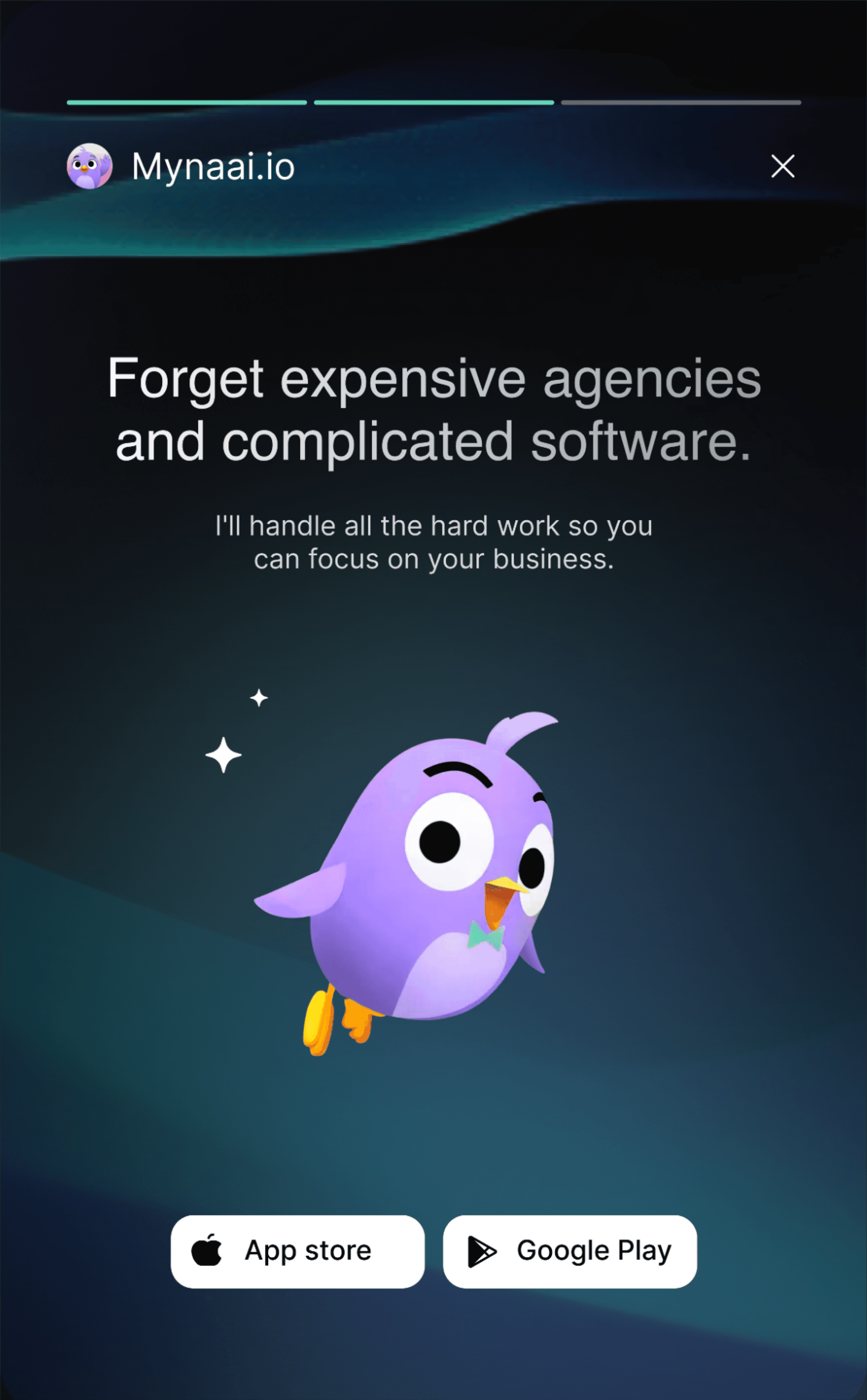
Mascot Exploration
The branding process began with designing the Myna bird character.
The goal was to create a mascot that represents intelligence and guidance while remaining simple enough to work across digital products.
Early explorations focused on different directions:
• expressive and playful characters
• abstract bird silhouettes
• geometric forms inspired by product UI elements


The final direction focused on simplicity and approachability.
Clean geometric shapes allowed the mascot to scale across product environments.
The character was designed to feel:
• curious
• helpful
• intelligent
• approachable


A guide, not a gatekeeper

A calm co-pilot in tough moments

Reliable and supportive, but never in the way

Someone who gets things done
The mascot was designed in Figma, animated in Spline 3D, and motion prototypes were explored using Kline AI.

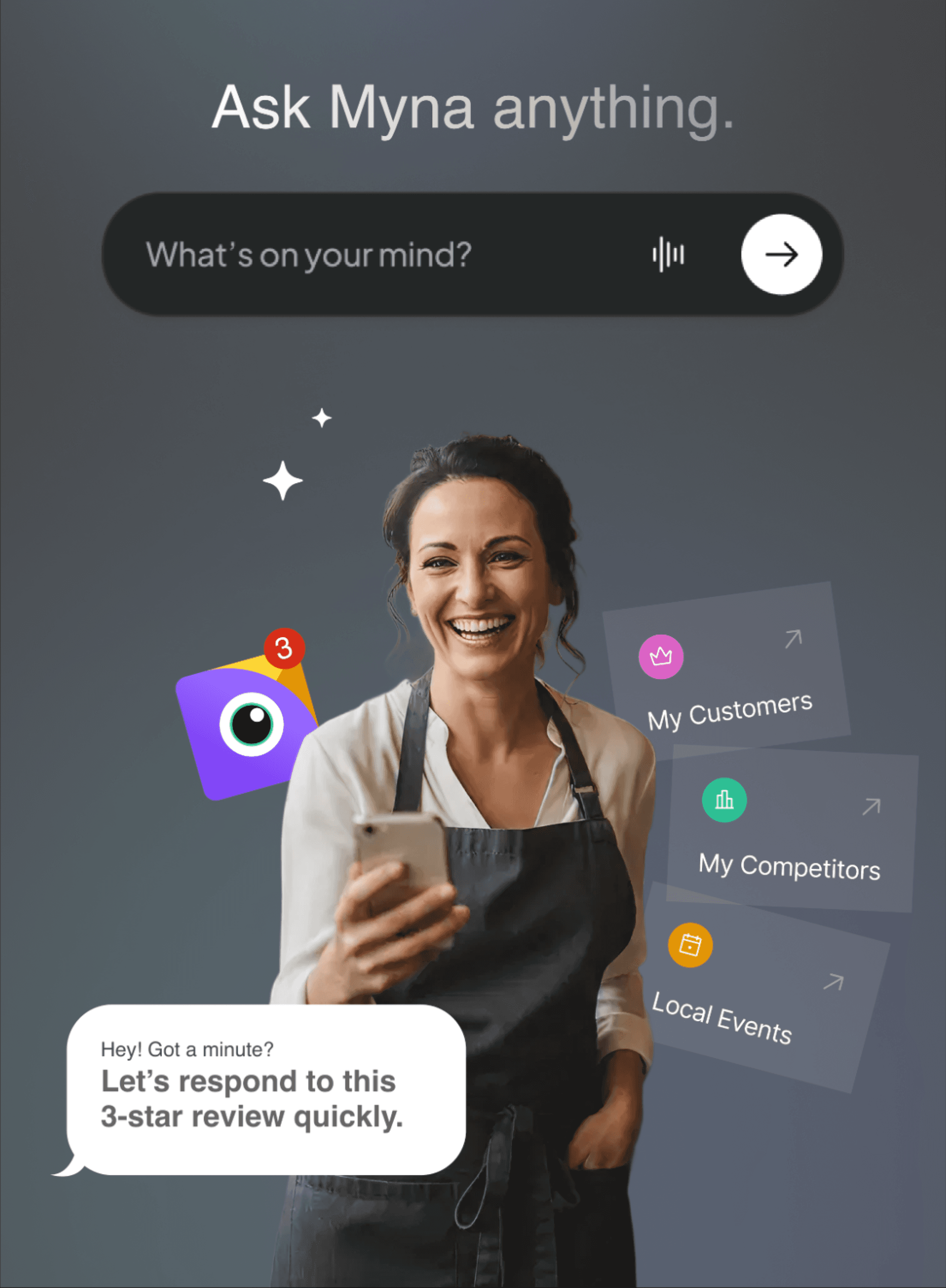
Mascot in the Product
The mascot plays a functional role in the product experience.
Rather than acting as decoration, the character appears during key moments such as:
• onboarding flows
• empty states
• success confirmations


In these moments, the mascot acts as a visual guide, reinforcing the idea that Myna helps users navigate complex systems.
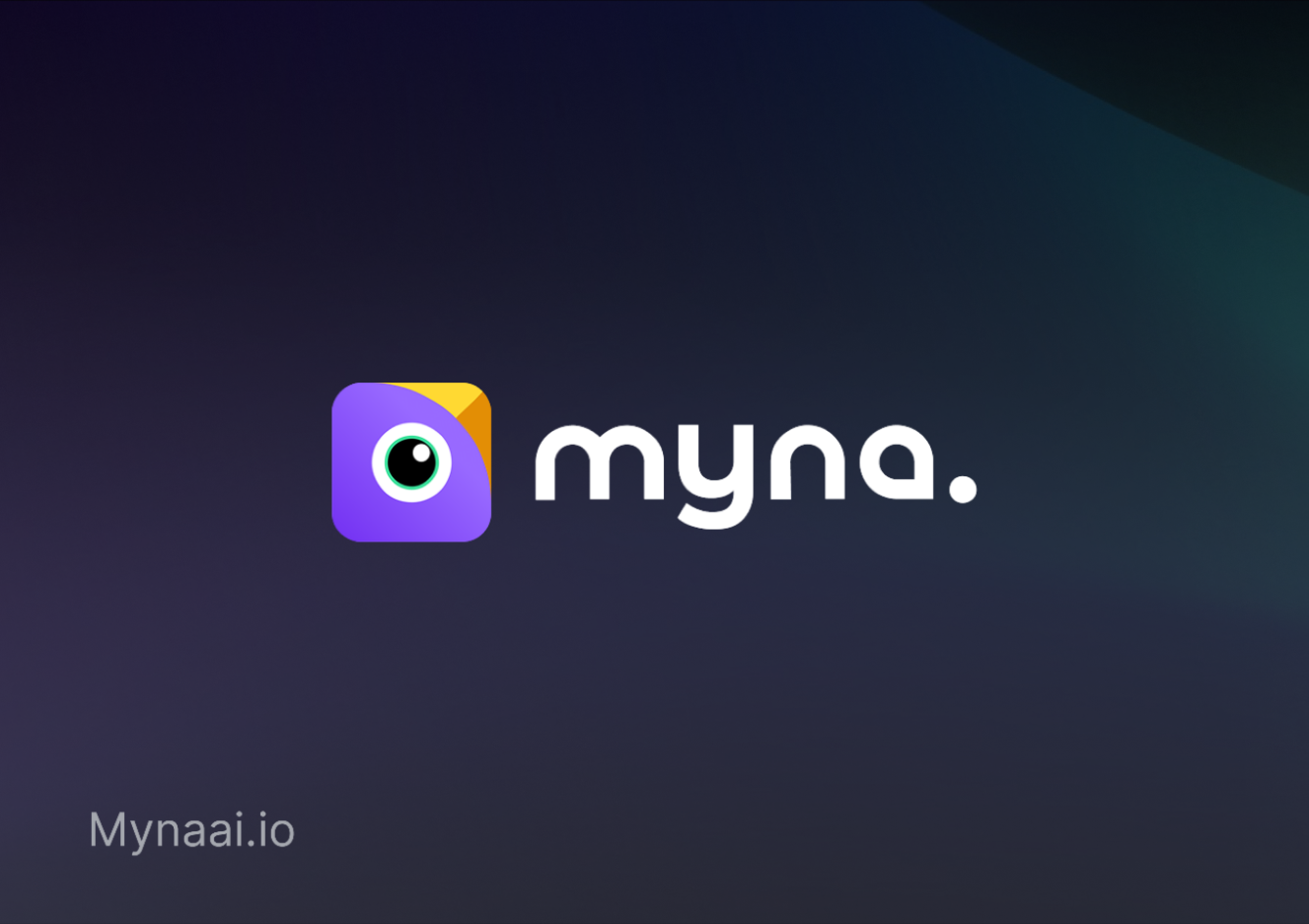
From Mascot to Logo
Once the mascot direction was defined, its geometry became the foundation for the logo.
Instead of directly using the character as the logo, the goal was to create a minimal symbol inspired by the structure and movement of the bird.
The final logo subtly combines mascot and word mark:
• The word Myna
• bird-like geometry inspired by the mascot
• minimal geometric construction


Brand Principles
Three core principles guided the visual identity.
These principles informed every decision across the identity system.
Typography
Typography was designed to support clarity in data-heavy interfaces.
The primary typeface is a modern sans-serif optimized for digital products.

Key characteristics:
• high readability in dashboards
• balanced geometric structure
• friendly but professional tone


The type system supports both product interfaces and marketing content.
Color System
Color reinforces the brand personality while supporting usability.
The palette balances trust, clarity, and energy.
Primary Color
A deep indigo tone representing intelligence and reliability.
Accent Color
A vibrant highlight used to emphasize actions, system feedback, and key interactions.
Neutral Palette
Soft grays and off-whites that support long-form product interfaces and reduce visual fatigue.
The color system was designed to work seamlessly across both product UI and marketing environments.

Voice and Tone: Character-driven moments
Myna communicates in a voice that feels clear, friendly, and supportive.
Instead of technical jargon, the product uses conversational language that helps users move through tasks confidently.

This parts easy, Follow me!

I noticed you skipped this, totally fine. You're the boss!

Yo! you've got a lot going on. Let's make this easier.
These interactions reinforce Myna’s role as a helpful co-pilot.
Design Patterns
The brand identity extends directly into the product experience.
Key interface patterns include:
• rounded UI components for approachability
• minimal iconography inspired by mascot geometry
• strong visual hierarchy for data-heavy dashboards
• subtle motion and feedback states
These patterns help maintain consistency across product and marketing surfaces.
Personality is the UX
Myna’s tone, timing, and behavior are the product strategy, not an afterthought.
The Experience
• Pops in at high-friction moments, stays subtle otherwise
• Conversational microcopy - real, not robotic
• Moves subtly - not distracting, just present
Feels like this
• Formal ↔ Casual tone – Always a joy to talk to
• Smooth ↔ Curious – asks just enough to stay useful, never nosey
• Feel safe ↔ Warm & Trustworthy – human, not sugary
• Flex ↔ Confident – Always on top of the game
Outcome
Starting the identity with a character created a strong emotional foundation for the brand.
The final system positions Myna as a modern, intelligent, and approachable platform, while maintaining clarity across complex workflows.
The identity now scales consistently across product interfaces, marketing, and documentation.