
Myna AI
| 2025
Pivoting an AI product from novelty to trusted execution system that drove +65% task completion for restaurant owners in 12 weeks
TL;DR
Myna launched as a swipe-based AI assistant optimized for speed. Early testing showed speed didn't translate to trust or action. I led a product pivot from a novelty interaction model to a task-driven execution system, shifting prioritization from the user to the system, so owners could act with confidence instead of constantly evaluating options.
My responsibilities included:
Product UX strategy · Interface design · Workflow architecture · AI interaction patterns · Design system development · Rapid prototyping and testing
Role
Product Designer
Team
Lean founding team (CEO, CTO, AI Engineer, Designer)
Domain
B2B SaaS · AI for Restaurant Tech
Platform
Agnostic (iOS and Android)
Timeline
12 Weeks (from audit → pilot)
Company
Early-stage / 0→1 / finding product-market fit
Outcome
Task Completion
+65%
Shifted from swipe evaluation to weekly task ownership. Completion went from <20% → +65%
User Confusion
-70%
Progressive disclosure reduced cognitive load measurably
AI Complaints
-50%
Constrained tap-based flows replaced free-form prompts
Early signals also showed improved repeat usage and clearer paths toward retention and monetization. Owners began completing work instead of merely reviewing suggestions.
Context
The job wasn't "more AI." It was getting owners to actually finish marketing work.
Myna is an AI marketing assistant for independent restaurant owners, helping them respond to reviews, manage social media, and run campaigns without hiring agencies or learning complex software.
The primary user:
an independent restaurant owner managing daily operations with marketing as a secondary responsibility. Used in short, interrupted sessions. High cognitive load. Low tolerance for ambiguity. Mobile-first.
Not designed for:
Agencies or enterprise chains. This was a solo operator product, and every decision had to reflect that reality.

Problem
Owners didn't trust the system enough to act. So the AI value never landed.
The swipe interaction looked frictionless in theory - one gesture, zero friction. In practice, it stripped away the context owners needed to feel confident. The experience felt like a stream of suggestions, not progress.
When asked to explain the experience, users said:

“What am I looking at?”

“It would make things faster.. but I wouldn’t pay for it.”

“I can just use ChatGPT and get all this done for free."
Baseline signals:
Returning users: <10%
Task completion: <20%
Willingness to pay: Low
The issue wasn’t usability alone; it was clarity and trust.
Problem statement
Restaurant owners didn’t trust AI-generated suggestions enough to complete real marketing work, preventing value, retention, and monetization.
What Went Wrong
The swipe concept was defined without user validation. Speed-to-market pressure drove assumption-based decisions.
I reviewed usability tests and interaction recordings. The same breakdowns appeared in every session.
UX Audit and user test issues mapped on swipe cards
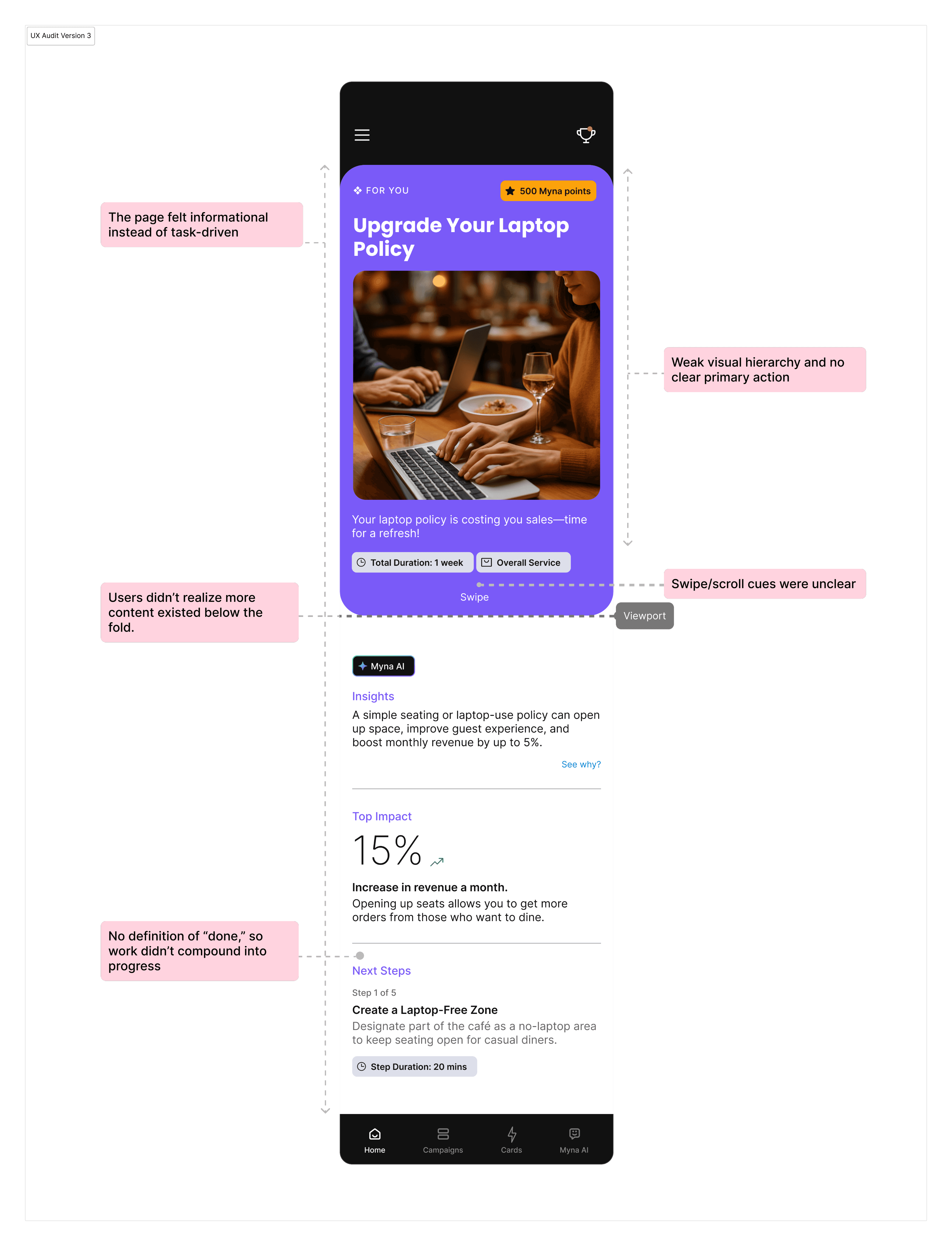
Root causes:
The swipe concept was defined without any user validation. Early decisions were assumption-driven, shaped by investor narratives and founder intuition from consumer swipe patterns, and industry momentum around AI speed.
Root Cause
The swipe concept was defined without any user validation. Early decisions were assumption-driven, shaped by investor narratives and founder intuition from consumer swipe patterns, and industry momentum around AI speed.
Assumptions (before research)
1
Initial Assumptions
Faster interaction (swipe-based approval) would increase task completion
Less friction would automatically translate to trust
Restaurant owners wanted more AI-generated options, not structured guidance
2
Why We Believed Them
Investor narratives around “AI speed”
Founder's intuition based on consumer swipe patterns
Industry momentum around ChatGPT-style free-form input
3
What We Expected to Validate
That faster interaction → higher completion
That users would feel confident approving AI output without added context
Strategy
Reframe Myna from “idea generator” to “execution system.”
Restaurant owners were time-poor and decision-fatigued. They didn’t want more options. They wanted:
1
A small set of high-impact actions
2
Clear priorities
3
Scope they could finish
4
Guidance that reduced thinking
Research sprint. (2 weeks)
1
13 restaurant owner interviews
2
Competitive benchmarking and SWOT
3
Affinity mapping and behavioral synthesis
4
Quantitative & qualitative patterns from usability sessions
Key Insight
Rather than designing for an “average user,” synthesis revealed 4 distinct behavioral groups:

Overwhelmed Operator
Daily operations · Low time · Low tolerance

Skeptical Pragmatist
Cautious · ROI-driven · Trust-sensitive

Outcome-Driven Owner
Results first · Opportunist · Revenue focused

Time-Poor Solo Manager
Single decision-maker · High cognitive load
Across all groups, owners consistently struggled with feeds, dashboards, and swipe mechanics. But they responded reliably to clear, outcome-driven tasks with defined scope and completion.
What Research changed
Invalidated
Speed alone builds trust
Validated
Clear scope + completion increases follow-through
Discovered
Owners preferred the system to prioritize work for them
Direction Shift
From reactive evaluation → system-driven execution
Design Principles
These principles guided every decision during the pivot
Clarity
Make priorities obvious in seconds
Execution
Make action feel lightweight and finishable
Trust
Make AI predictable before powerful
Evaluated Directions
I explored three structural approaches before committing to a direction, evaluating each through the lens of small-screen behavior, interruption-heavy use.
Refined swipe model
Fast, daily execution of the top-priority action
Felt reactive and transactional
But framed work as isolated reactions
No clear signal of how actions compounded into progress

AI-ranked suggestions feed
More context and options surfaced
Shifted prioritization back to the user
Required scanning and comparison
Increased hesitation and decision
fatigue

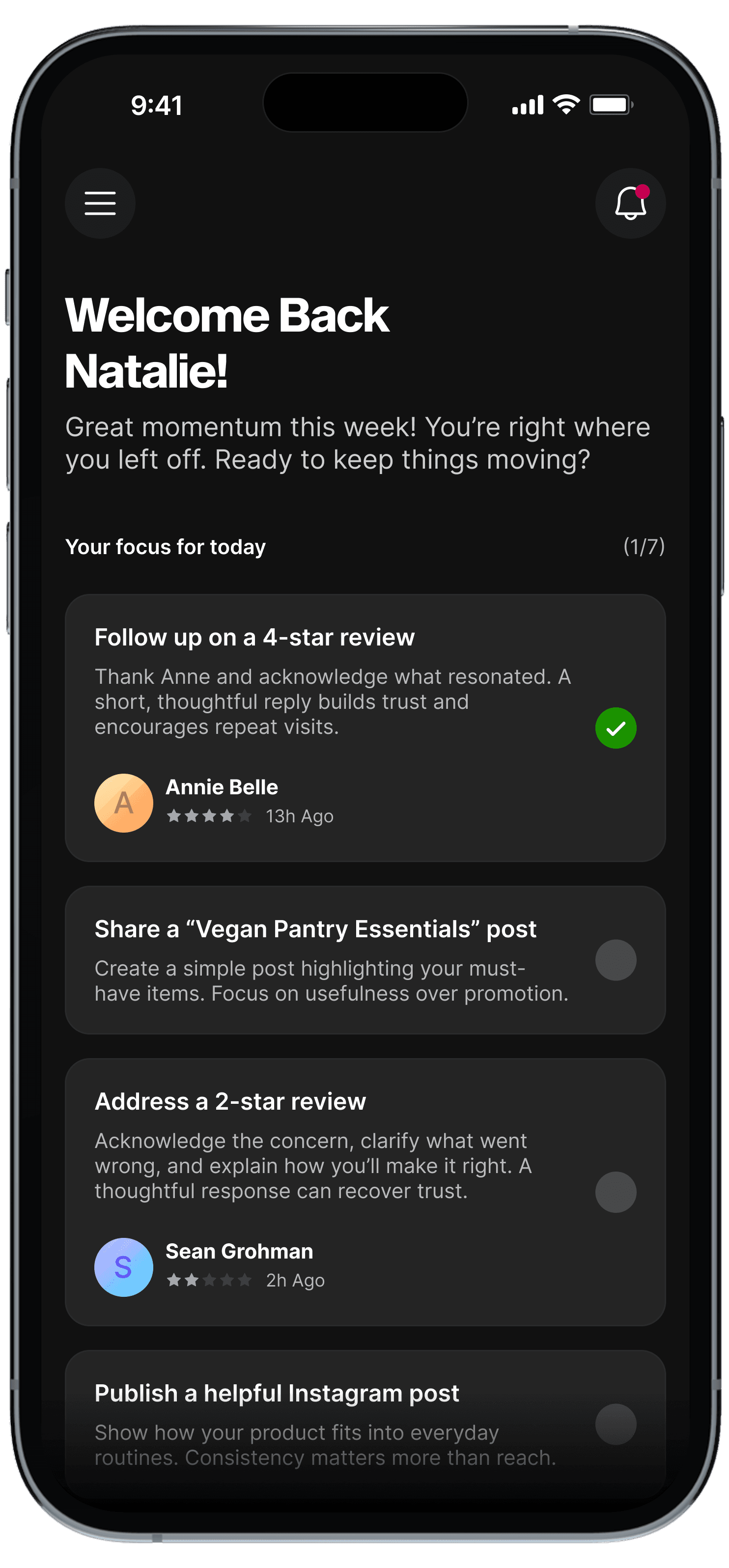
Task-based workflow
Explicit responsibilities and completion
Clear priorities and scope
Stronger sense of control and progress
Reduced thinking, increased follow-through

Decision
We committed to the task-based workflow.
Swipe and feed models still required owners to manage work mentally. Tasks moved that responsibility into the system.

Designing the System
However, early versions exposed too much detail upfront, causing hesitation and drop-off.
I simplified the entry point to show only what mattered now, revealing details after intent through progressive disclosure suited for small screens.
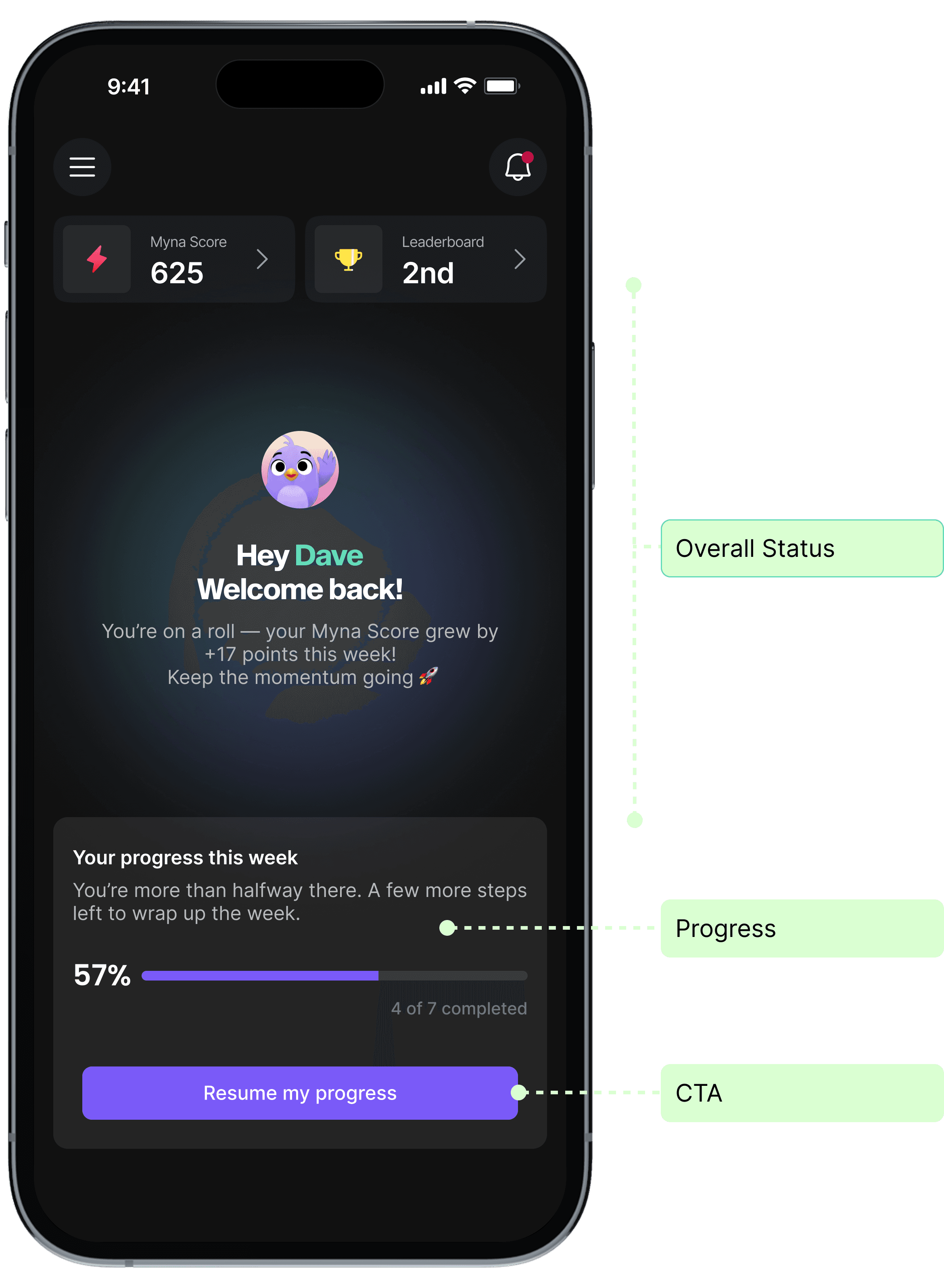
Before: Tasks visible upfront
After: Shows overall progress to orient the user
How this translated into the final product
Overview
What matters now
Prioritization
Why it matters
Execution
How to complete it
This structure reduced initial scanning cost and helped users orient quickly during short, interrupted sessions.
Behavior shift we saw
Home oriented users
Task list helped them prioritize
Task Chat supported execution
Users moved from browsing to completing.
Reframing Work from Daily Pressure to Weekly Progress
Daily tasks felt like an obligation. Missing a day felt like failure, even when business impact was minimal.
I grouped actions into weekly task cycles, intentionally limiting how much work appeared at once.
Before: Daily pressure

After: Weekly task cycles


Weekly framing reduced anxiety, gave owners flexibility to act when they had time, and created a clearer sense of completion.
A Small but Necessary Adjustment
In real usage, campaign work took longer than a single week and couldn’t be completed within the task cycle.
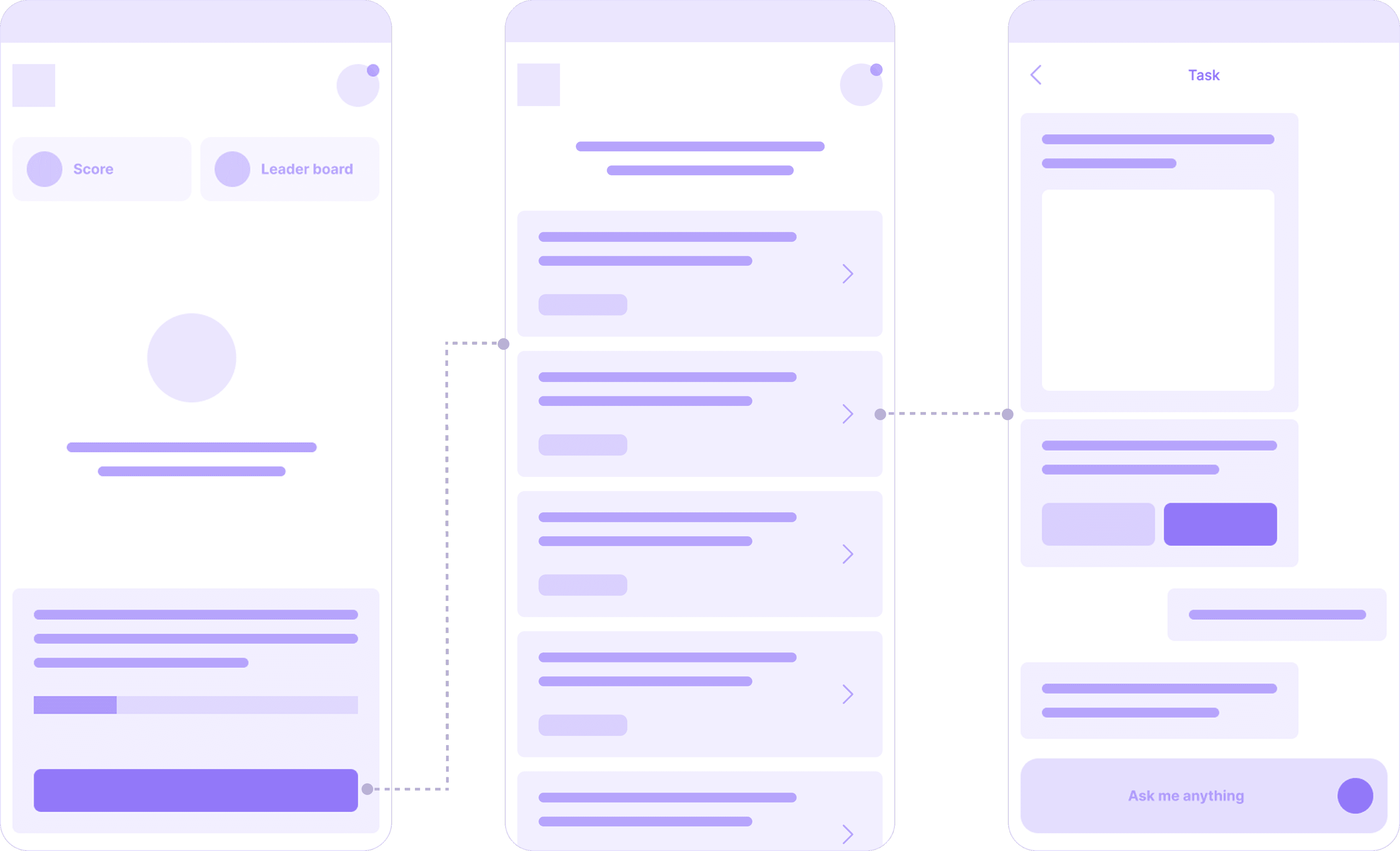
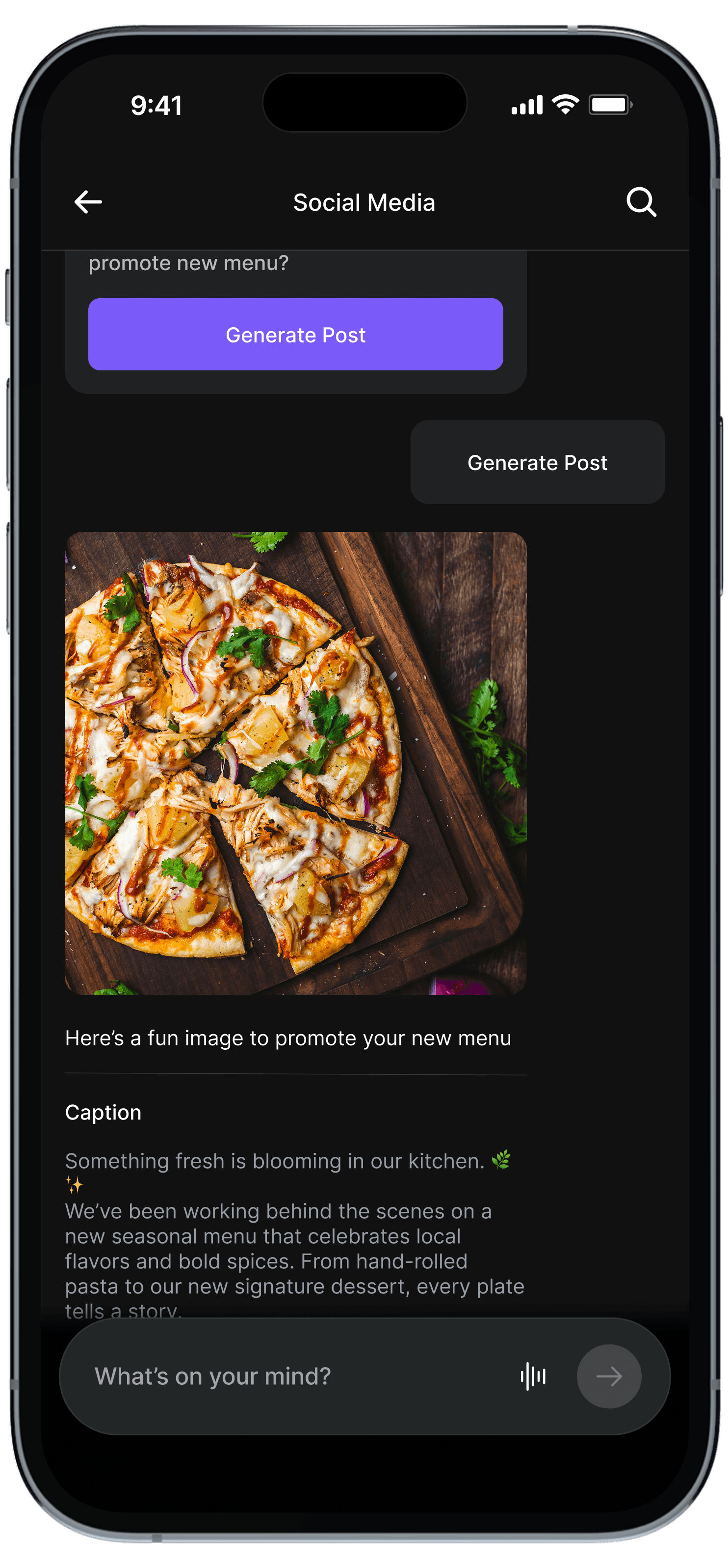
To account for this, I introduced a tab structure that separated high-impact, quick tasks from longer-running campaigns.
Before: Tasks and campaign steps were combined in a single list.
After: Quick tasks separated from ongoing campaign work.

Testing in the Real World
We piloted the redesigned experience with 10 restaurants in 2-week cohorts.
What worked:
Owners completed weekly tasks within 1-2 days.
Guided chat felt natural and supportive.
The experience felt focused, not overwhelming.
What surfaced
Campaigns still felt heavy for some users.
Free-form prompt led to vague questions, generic responses, and occasional hallucinations.
AI Design Trade-off: Flexibility vs Trust
Free-form chat sounds powerful. But in early adoption, inconsistent AI behavior and unclear outcomes broke trust quickly.
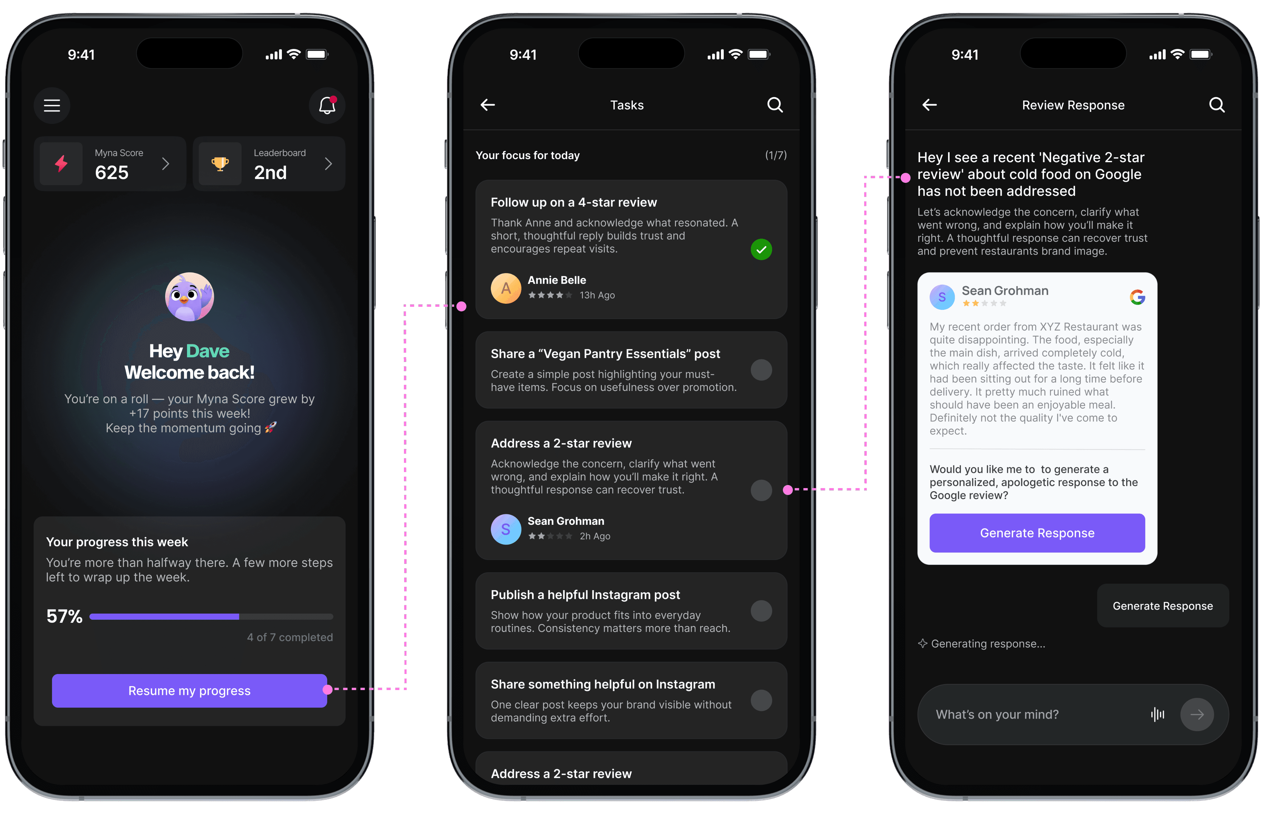
I reduced flexibility to make outcomes predictable, Using Claude Code, I prototyped a shift from free-form input to constrained, tap-based flows that kept AI inside a known lane.
Before: users type anything → AI response quality varies
After: users tap through a constrained flow → AI stays inside a known lane
This significantly reduced AI-related complaints during early adoption.
How We Measured Trust and Execution
Success was defined by completed work, not interaction speed.
We defined success around whether restaurant owners could confidently complete real marketing work, not how quickly they could interact with AI. Metrics were chosen as signals of trust, clarity, and execution, helping us validate design decisions and guide trade-offs.
+65%
Task Completion
Completion was the clearest indicator of trust and value. After shifting from swipe interactions to weekly task ownership, task completion rose from under 20% to +65%.
-70%
User Confusion
Tracked through usability sessions and support feedback. Progressive disclosure and a simplified entry point reduced confusion by 70%.
-50%
AI-Related Complaints
Used as an early warning for AI reliability during onboarding. Constraining AI interactions reduced complaints by 50%.
See impact breakdown here
Early Retention & Monetization Signals
Repeat usage and willingness to engage with paid workflows were tracked as secondary signals. As owners started completing weekly tasks (instead of only reviewing suggestions), retention improved and paths toward monetization became clearer.
Design System
As the product expanded, maintaining visual and interaction consistency became important.
I created a lightweight design system including:
• Foundations (Color palette basics and semantic, Typography, spacing)
• Components using atomic design
• Design patterns


Constraints & Design Trade-offs
We were a lean team, so every trade-off prioritized speed, clarity, and core usability over visual delight.
1
AI Breadth vs. Task Completion
We focused on a small set of high-value workflows instead of a broad assistant. Follow-through improved because value became easier to see.
2
Flexibility vs. AI Reliability
We constrained chat to stabilize trust early. Predictability beat power during adoption.
3
Novelty vs. Business Outcomes
We replaced swipe novelty with outcome-focused tasks. Completion went up, confusion went down, and owners became more willing to act.
These patterns became reusable, enabling scale without reintroducing cognitive load.
My Learnings
The work required navigating uncertainty, experimenting early, and treating failure as a signal to iterate toward better outcomes.
1
Trust must come before intelligence in AI products. People return for usefulness, not novelty.
2
Validate early, observed behavior is more reliable than assumptions
3
Constraint can be a feature when users are overloaded
Next Steps
1
Strengthen trust and accuracy before expanding flexibility
2
Identify the single workflow users would pay for
3
Build retention loops tied to real restaurant activity.