
Myna AI
| 2025
Pivoting an AI product from novelty to trusted execution for restaurant owners
Role
Founding Product Designer
Team
CEO, CTO, AI Engineer
Domain
B2B SaaS · AI for Restaurant Tech
Timeline
12 Weeks

TL;DR
Myna is an AI-powered marketing assistant for restaurant owners that helps them respond to reviews, manage social media, and run campaigns through high-value growth actions.
Myna originally shipped as a swipe-based “approve/dismiss” AI assistant. Early testing showed that speed didn’t translate to action or trust.
I led research and rebuilt the product model around outcome-driven tasks, weekly cadence, and constrained AI interactions to increase confidence and follow-through.
Results
Boosted task completion rate
+65%
Reduced user confusion
-70%
Cut down AI-related complaints
-50%
STAGE 1 - UNDERSTANDING WHY THE PRODUCT FAILED
On paper, the experience felt fast and lightweight.
In reality, it wasn’t working.
Early Product Vision
Myna launched as a swipe-based marketing assistant. Owners could swipe right to approve suggested actions or swipe left to dismiss them “one gesture, zero friction.”
Owners didn’t trust the system enough to act, so AI value never landed.
The swipe interaction reduced effort, but also removed meaning, trust, and decision confidence.
Why the Original Experience Failed
When asked to explain the experience, users said:

“What am I looking at?”

“It would make things faster.. but I wouldn’t pay for it.”

“I can just use ChatGPT and get all this done for free."

UX Audit and user test issues mapped on swipe cards
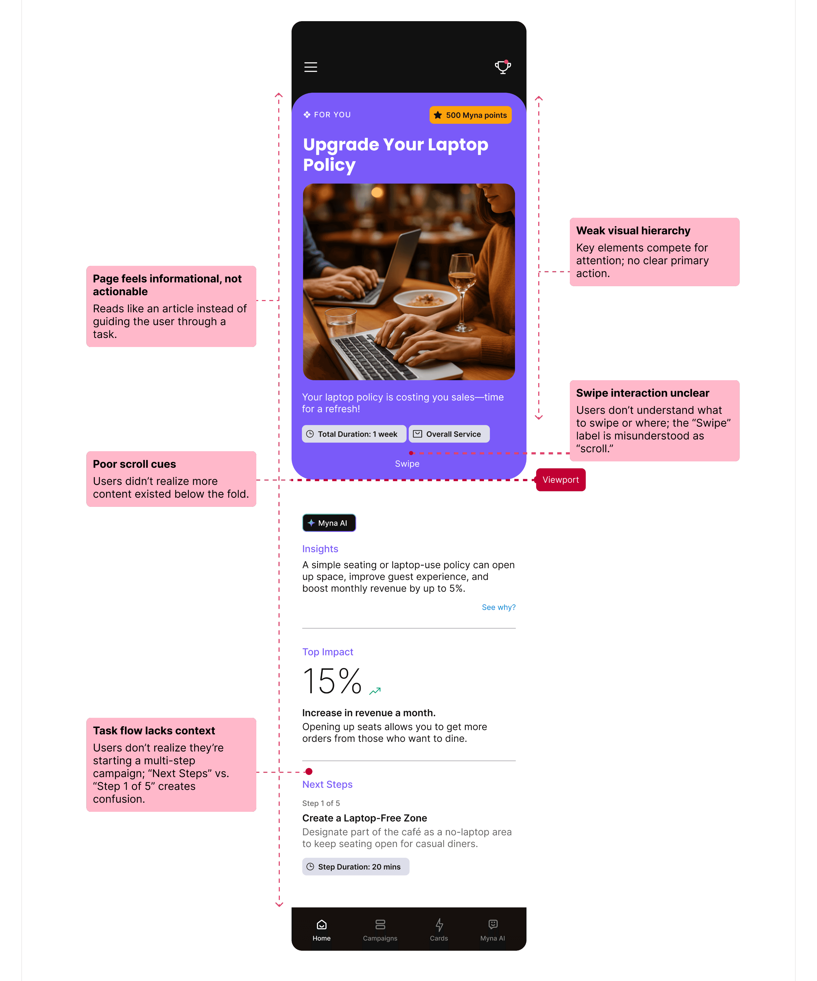
Reviewing usability tests and interaction recordings revealed the same breakdowns across sessions.
The swipe interaction reduced effort, but also removed meaning, trust, and decision confidence.
Reviewing usability tests and interaction recordings revealed the same breakdowns across sessions.
1
The page felt informational instead of task-driven
2
Weak visual hierarchy and no clear primary action
3
Unclear swipe vs scroll cues
4
No context for why actions mattered
What Broke
The issue wasn’t usability alone; it was clarity and trust.
Returning users
<10%
Task Completion rate
0%
Willingness to pay
Low
Evidence
Swipe concept was defined without any user validation.
Misalignment and unclear value
1
Early decisions were assumption-driven, shaped by speed-to-market pressure and investor expectations.
No dedicated UX research
2
As a result, the product optimized for interaction speed instead of confidence in decision-making.
Root Cause
To understand what restaurant owners actually needed, I led a focused research sprint.
Reframe Myna from “idea generator” → “system that guides execution”
Research Summary:
Owners are time-poor and decision-fatigued.
They prefer guided execution over flexibility.
Dashboards, feeds, and swipe interactions failed across all users.
1
User interviews (13 owners)
3
Affinity mapping + behavioral synthesis.
2
Competitive benchmarking + SWOT
4
Quantitative & qualitative analysis
Research Methods:


Research: Reframing the Problem
Rather than designing for an “average user,” synthesis revealed 4 distinct behavioral groups:
The Overwhelmed Operator
Daily operations · Low time · Low tolerance
Runs the business day to day; marketing is deprioritized
Needs clear, high-impact actions
Breaks with dashboards, feeds, and exploration

Constantly evaluates if a tool is worth the effort
Needs predictability and context before trusting AI
Breaks with novelty UX and vague recommendations
The Skeptical Pragmatist
Cautious · ROI-driven · Trust-sensitive

Cares about reviews, leads, and revenue
Will pay when effort-to-impact is obvious
Breaks with shallow engagement
The Outcome-Driven Owner
Results first · Opportunist · Revenue focused

Constant context switching
Wants the product to think ahead and guide action
Breaks with options and interpretation-heavy tools
The Time-Constrained Solo Manager
Single decision-maker · High cognitive load

Key insight:
All groups struggled with feeds, dashboards, and swipe interactions but responded well to clear, outcome-driven tasks.
Research to Product Structure
STAGE 2: REFRAMING THE PROBLEM
"How can I make Myna less of a tool… and more of a partner?"
The real problem was not generating ideas.
It was getting the right work done consistently without requiring ongoing thinking.
This meant shifting Myna from a system that suggested work to one that guided execution.
What problem we were solving
Restaurant owners are:
Time-constrained
Decision-fatigued
Skeptical of AI
"If marketing were reframed as a small set of outcome-driven tasks with proactive guidance, owners would feel more in control, trust the system, and take consistent action."
Hypothesis
System:
Decided what mattered
Limited how much work appeared
And clearly defined what “done” meant
User:
Stop evaluating
Act with confidence
And trust the system more over time.
Easy to Understand
Clear prioritization and hierarchy so users immediately know what matters and why.
Easy to Act On
Decisions should feel lightweight and achievable, even in short sessions.
Trust First, Then Intelligence
AI must feel reliable and predictable before it feels powerful.
Before designing screens, I defined principles to guide how AI, tasks, and decisions should appear for restaurant owners.

Easy to Understand
Clear prioritization and hierarchy so users immediately know what matters and why.
Easy to Act On
Decisions should feel lightweight and achievable, even in short sessions.
Guided, Not Guesswork
Proactive system guidance that guide users instead of asking them to interpret.
Trust First, Then Intelligence
AI must feel reliable and predictable before it feels powerful.
Design Principles
I explored 3 structural approaches. Early reviews and usability feedback revealed clear behavioural differences.
Refined swipe model
Fast, daily execution of the top-priority action.
Felt reactive and transactional
But framed work as isolated reactions
No clear signal of how actions compounded into progress
Actions executed correctly


AI-ranked suggestions feed
More context and options surfaced.
Shifted prioritization back to the user
Required scanning and comparison
Increased hesitation and decision fatigue
Looked intelligent

Task-based workflow
Explicitly defined responsibilities and completion.
Clear priorities and scope
Visible start and end states
Stronger sense of control and progress
Reduced thinking, increased follow-through
Concepts Explored
Direction

Why task-based workflow:
This shift from reactive → proactive reduced cognitive load and consistently drove completion.
The difference was ownership of decisions.
Swipe and feeds still required users to mentally manage work.
Tasks transferred that responsibility to the system.

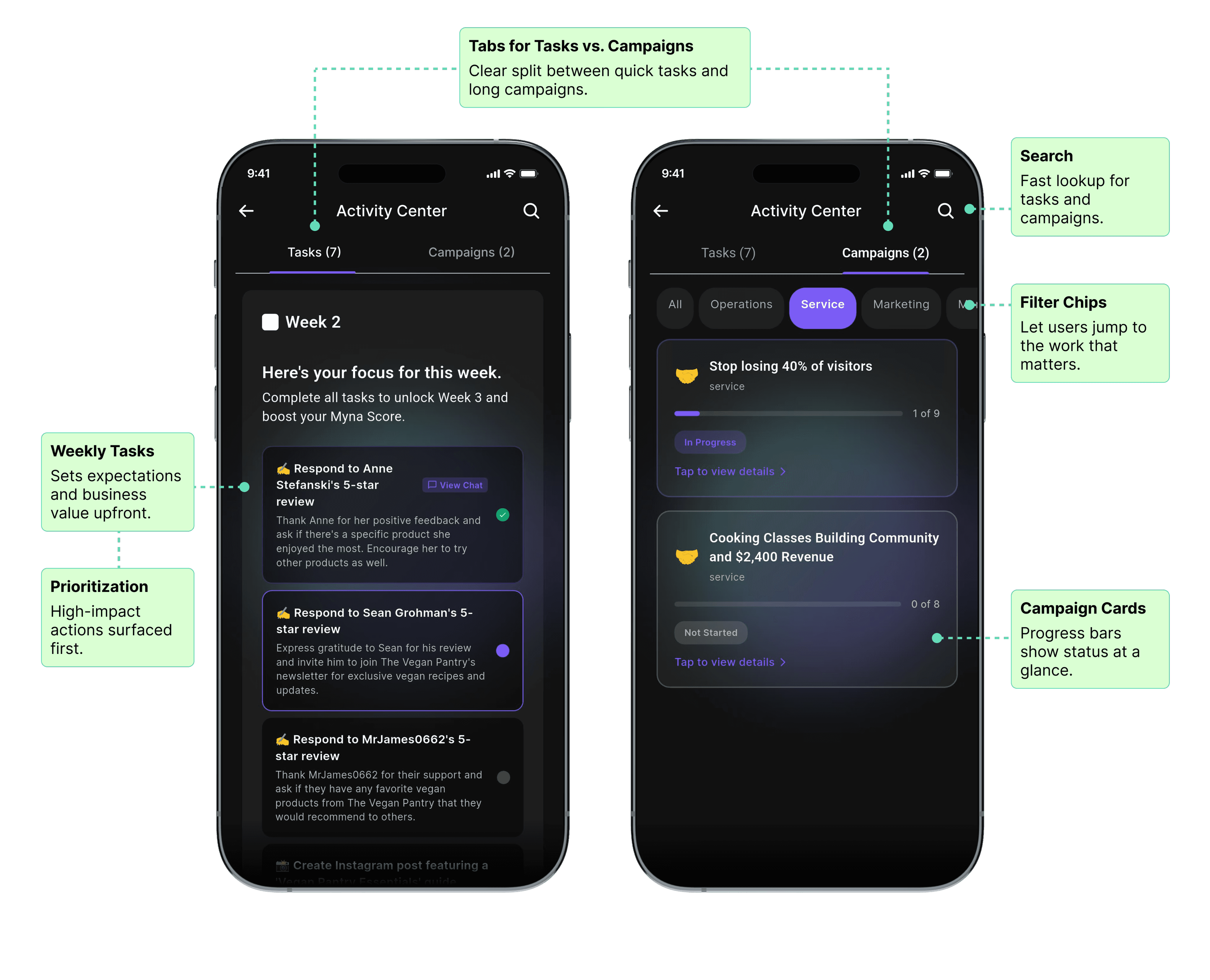


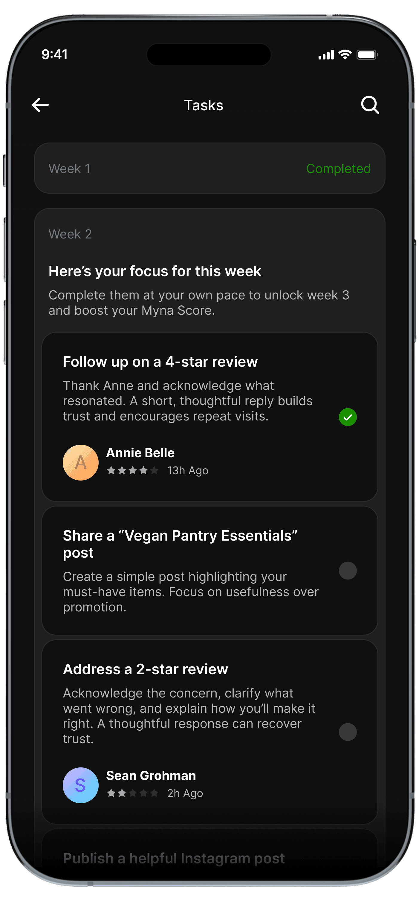
Final UI
Progressive disclosure: We revealed complexity only as users showed intent
1
Overview: What matters now
2
Prioritization: Why it matters
3
Execution: How to complete it

How this translated into the final product
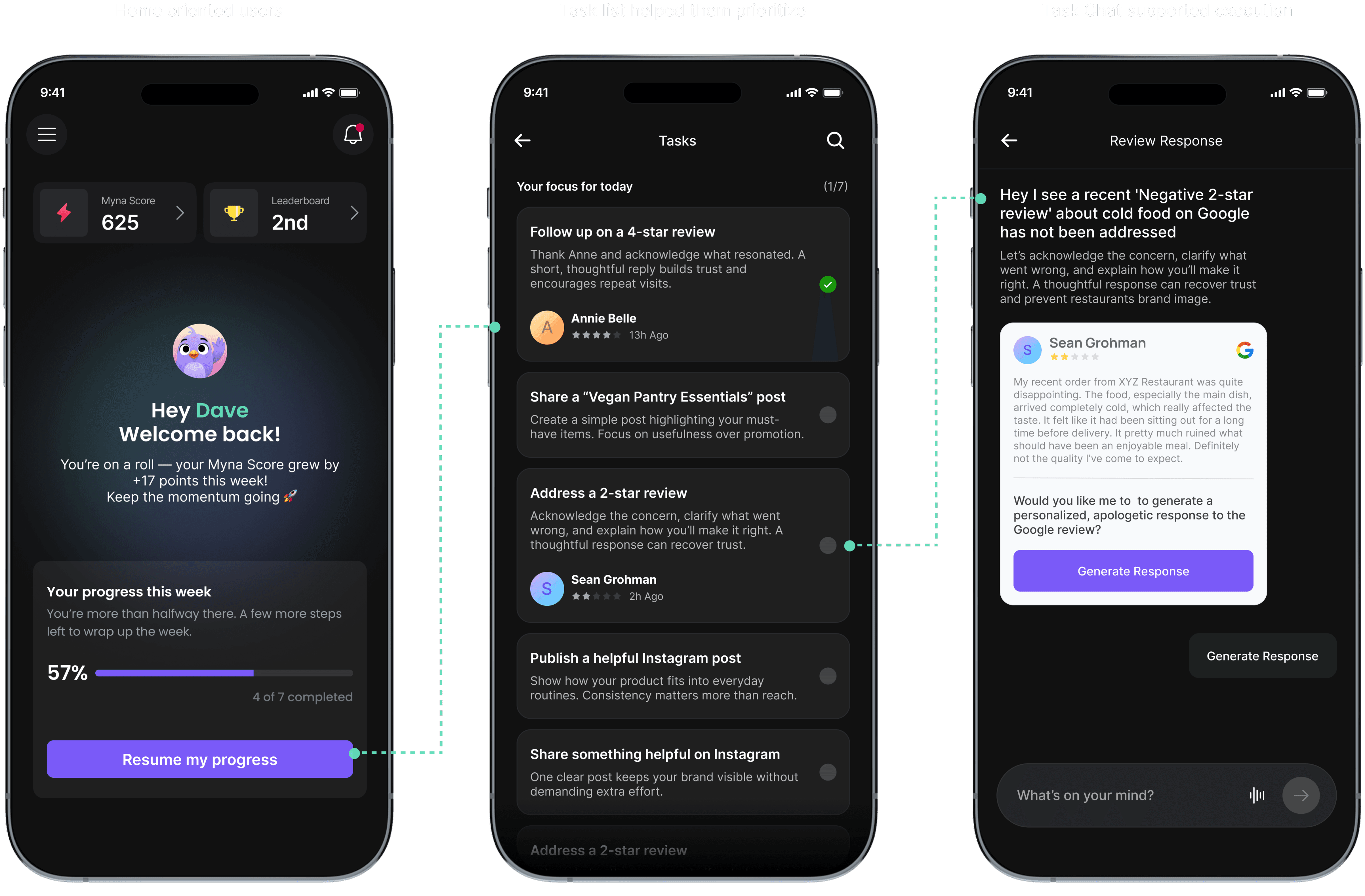
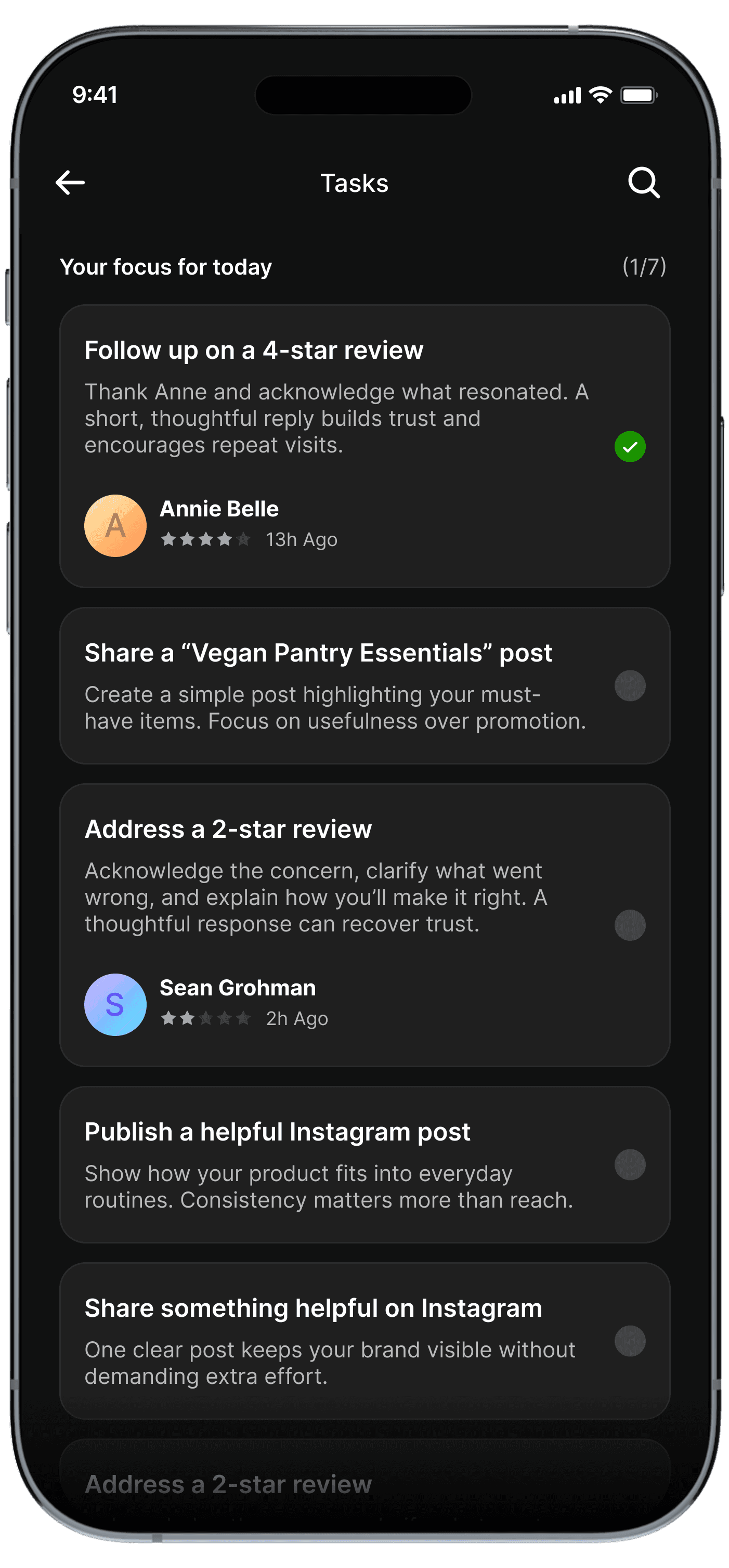
However, early versions exposed task details immediately. Users scanned, paused, and hesitated. Sessions were short and often interrupted by real-world work.
So I removed details from the entry point and reduced the home screen to only three things:
Everything else was intentionally hidden.
This helped users orient quickly and move forward without thinking too much.


Entry: What Users See First
Once we committed to a task based model, the next challenge was scope and cadence.
Weekly framing reduced anxiety, gave owners flexibility to act when they had time, and created a clearer sense of completion.
Before
Daily tasks made the product feel like something you had to check every day. That framed Myna as a stream of obligations. Missing a day felt like failure, even when the business impact was minimal.
I grouped actions into weekly task cycles. By intentionally limiting how much work appeared at once, users could finish what mattered, feel done, and move on with confidence.
After

Narrowing the System
Old (Swipe-based)
Pull-based (user has to look at content)
Gamified gestures
Shallow actions (“approve content”)
No clarity on value
No guidance

New Concept (Task-focused)
Push-based (app highlights what matters)
Structured tasks & flows
High-value actions (reviews, metrics, leads)
Direct business outcomes
Proactive intelligence


What Changed
We piloted the redesigned experience with 10 restaurants in 2-week cohorts.
Patterns emerged quickly:
Owners completed weekly tasks within 1-2 days.
Guided chat felt natural and supportive.
The experience felt focused, not overwhelming.
At the same time, testing surfaced important weaknesses:
Campaigns still felt heavy for some users.
And more critically, early AI behavior wasn’t reliable enough.
Free-form prompts led to vague questions, generic responses, and occasional hallucinations; which quickly eroded trust during early adoption.
See usability comments here


Testing in the Real World
This reduced flexibility; but dramatically increased predictability and confidence.
AI interaction was constrained. Free-form chat was replaced with tap-based interaction.
Before: with chat input

After: tap-based flow replaces chat
While detailed A/B testing or extended usability studies are ongoing, early testing and direct feedback from users helped inform rapid iterations post-pivot.
AI Design Trade-off: Flexibility vs Trust
Boosted task completion rate
+65%
Reduced user confusion
-70%
Cut down AI-related complaints
-50%
Early results showed meaningful improvement in behavior and trust.
We intentionally validated engagement and execution first, before optimizing for revenue.
Metric
Baseline (Old System)
After Redesign (Week 1-4)
Change
How we measured
Task Completion (Adoption)
Less than 20% of recommended actions completed (6 pilot users, Usability test)
85% completed (10 pilot users)
+65% points
Analytics and task logs.
User Confusion (Clarity)
Avg. 3 navigation errors per session
< 2 errors per session.
Confusion: ↓70%
Usability testing and session recordings.
AI-Related Complaints (Trust)
Almost everyone had issues trusting the AI insights.
5/10 users complained about AI hallucinations and generic insights.
Complaints dropped post iteration: ↓50%
Direct user feedback and internal testing.
Continued Engagement (Retention)
N/A (new product pivot)
Drop after Week 1; users completed tasks within 1–2 days
-
Activity logs and follow-up interviews.
Session Duration (Activity)
-
< 3–4 min avg.
↓ (needs engagement loops)
Analytics tracking session duration
Impact
1
Delivered key screens and edge cases rapidly
2
Guided junior designers through structured QA
3
Leveraged Claude code for vibecoding
4
85% of final screens met quality standards
5
Detailed handoff in Figma and QA tracked in GitHub
Execution Under Constraints
On a tight timeline, I focused on delivering high-quality key screens rapidly
Detailed dev handoff in Figma.


QA documented in Figma, issues tracked in GitHub.


As a lean team, each trade-off prioritized speed, clarity, and core usability over visual delight aligning user needs with business goals.
AI Breadth vs. Task Completion
Choice: Focused on a small set of high-value workflows instead of a broad AI assistant.
Impact: Clearer value and higher completion.
Conversational Flexibility vs. AI Reliability
Choice: Constrained chat, temporarily replacing free-text input with tap-based actions to stabilize trust.
Impact: Predictable AI behavior and confidence.
Novelty vs. Business Outcomes
Choice: Replaced swipe interactions with outcome-focused tasks.
Impact: Task completion increased by 65%, user confusion dropped 70%, and willingness to act improved.
Constraints & Design Trade-offs
My Learnings
This project humbled me in the best way possible. It was messy and ambiguous, failed, experimented and learnt fast.
01
Solve real problems first. Design polish cannot replace weak value.
02
Validate early. Observing actual behavior is more reliable than assumptions.
03
Build trust before engagement. Users return for usefulness, not novelty.
04
Prioritize reliability over flashy features. Stable, context-aware AI drives adoption.
06
Failure is a mirror, not a verdict. Every misstep taught more than success, improving the product and my user-centered approach.
06
Failure is a mirror, not a verdict. Every misstep taught more than success, improving the product and my user-centered approach.
Next Steps
Evolve from a task-based workflow to a multi-modal experience combining tasks, insights, content, and guidance
1
Reopen pilots after core improvements to gather deeper qualitative feedback on real business outcomes
2
Validate willingness to pay by identifying the single workflow users value most
3
Strengthen AI trust through improved accuracy and clearer trust signals
4
Unify information architecture across chat, tasks, insights, and notifications
5
Build retention loops tied to real restaurant activity, not vanity engagement
6
Track metrics like adoption, retention, revenue, referrals
See ongoing exploration